I love this. I have a background in graphic design and time and time again I’ve had to work my ass off to convince clients that less is more (it’s even the same design philosophy I use when modifying my cars!).
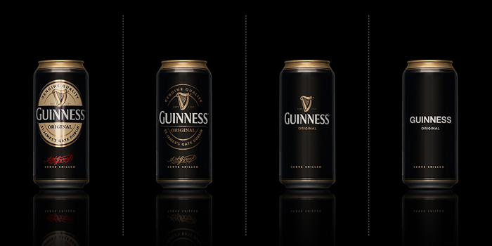
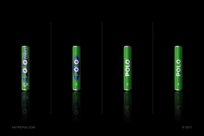
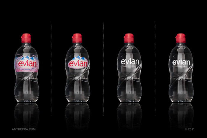
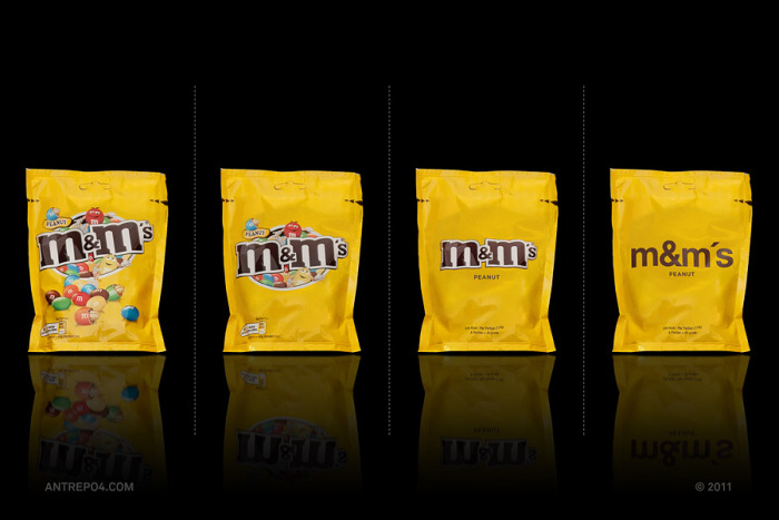
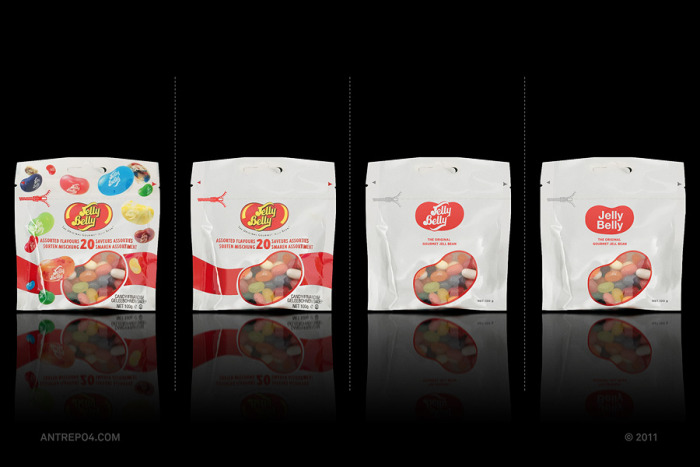
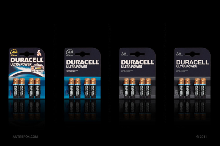
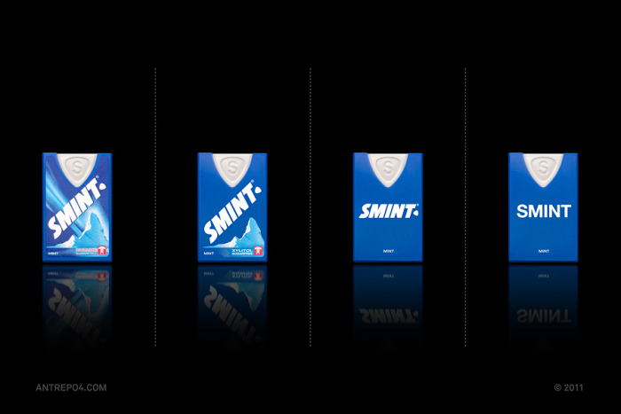
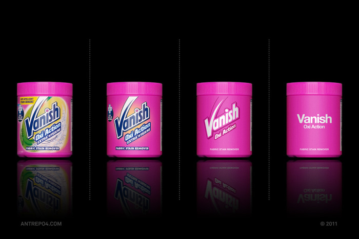
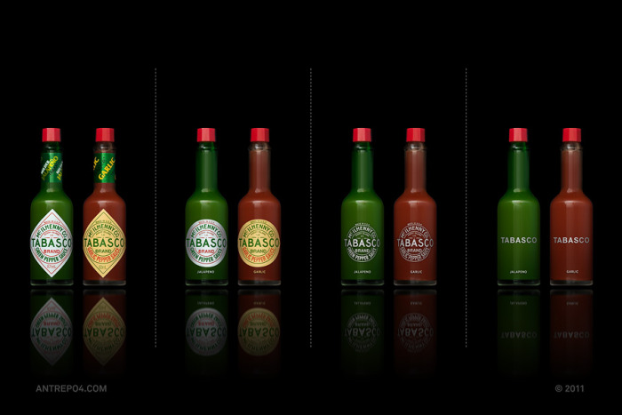
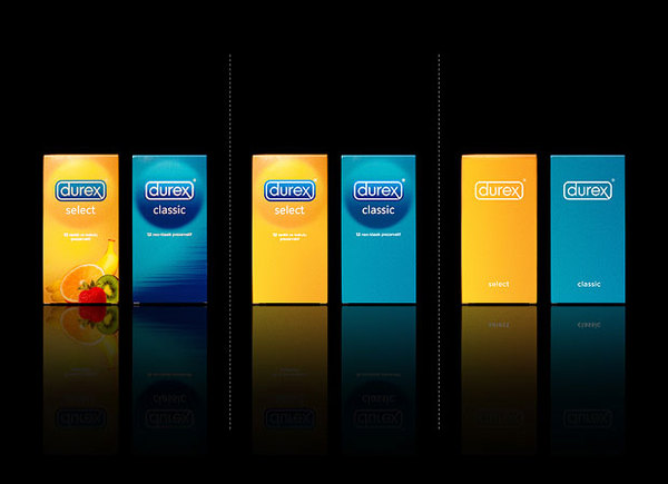
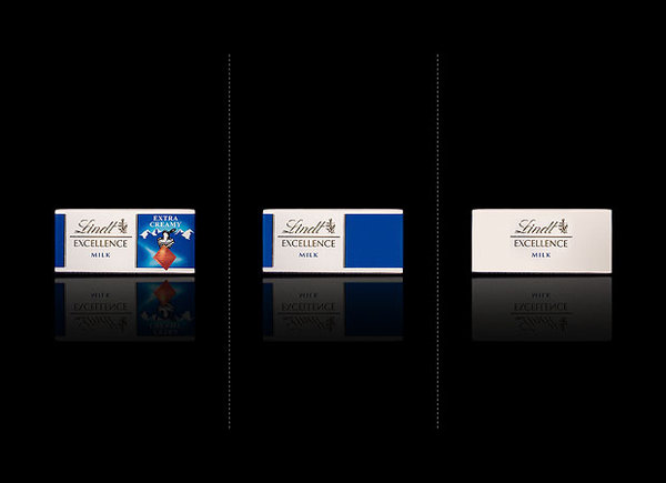
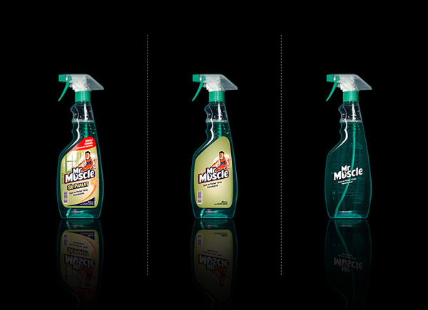
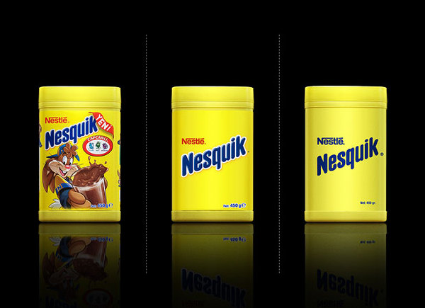
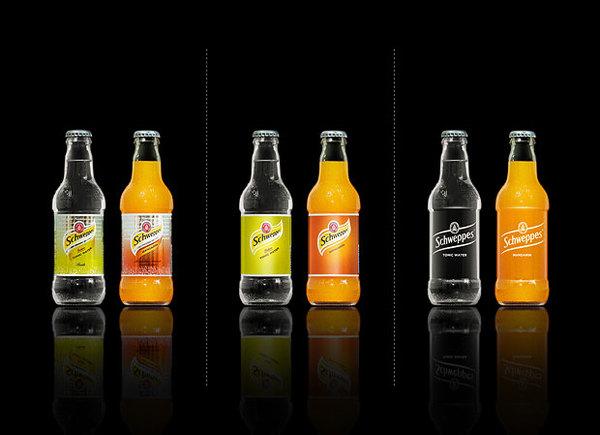
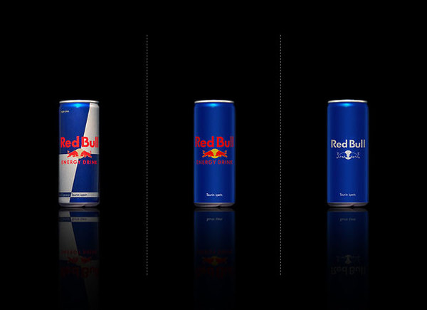
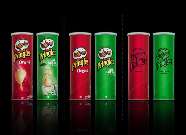
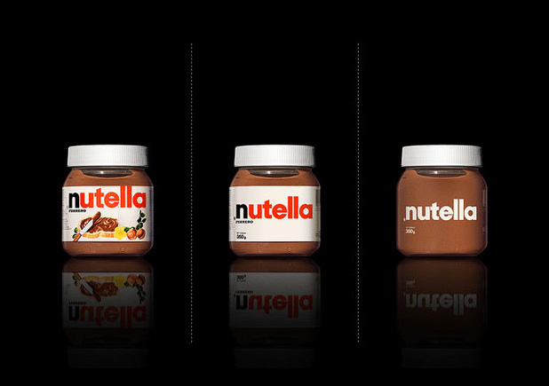
Mehmet Gozetlik of the design collective Antrepo has created this awesome set of images where he’s taken brands as seen on the shelves and created more minimalistic versions of them. Whilst he’s probably gone too far on some of them, others are just spot on and I get weak at the knees imagining what a Coles or Woolworths would look like if all the goods on the shelves were as nice as these minimalistic designs.
So which of the 4 different variations in most of these designs do you guys prefer? 1. Original – 2. Simplified – 3. Even more simplified or 4. No logo variation?
Source: http://www.a2591.com/2011/03/more-minimalist-effect-in-maximalist.html